
FRNG
FRNG (fringe) is a next-generation design research studio created specifically to work agilely with small businesses in emerging markets. I designed their brand identity, website, and social templates.

Intro
After years of working in research firms that followed the same old focus group methods, the founders of FRNG felt there has to be a better way to reach consumers. They saw that with new markets emerging in non-traditional products like cannabis, non-binary fashion, and remote work, underserved populations were being missed by traditional research. So they set out to start a new kind of agency that would work with companies that wanted to serve the fringe groups of society.
Goal
The goal for the FRNG brand would be to help them stand out from the traditional market research agencies that flood the market. It would also need to convey its focus on the human experience that drives the work of the team. With the target audience being brand managers, innovation teams, and product organizations the brand would also need to be clean and professional.
Process
It’s important for me to start a design project with my stakeholders to ensure we are aligned on the goals and strategy for the project. I began with a stakeholder interview to determine what the core values of the brand would be. As we explored the motivations and goals of the founders' patterns began to emerge around rejection of traditions and shifting paradigms. The values that we developed are: disruptive, rebellious, curious, and immersive.

Using the brand values as a target I begin the design phase with mood boards. This is a translation and synthesis process, allowing the client to voice their thoughts on visual elements. It requires questioning the client’s opinions and requirements to understand their core motivations.
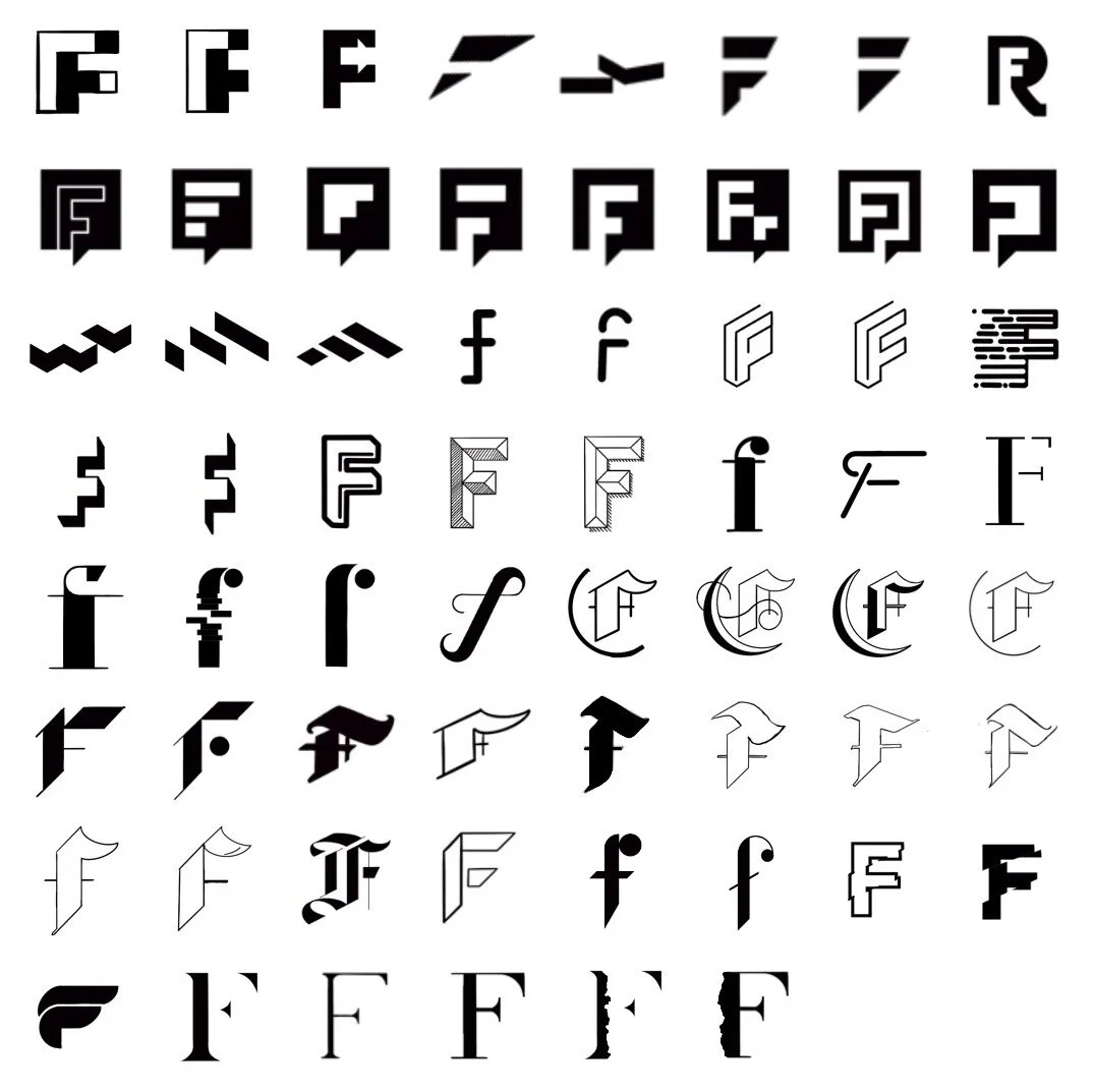
From the mood board, a visual lexicon is established to guide the later phases of the design process. Experimenting with letterforms I searched for an iteration that would synthesize the brand values into a single mark. Sketching in black and white I focus on the silhouettes of the market to create a bold scalable icon.


Solution
The final brand mark utilizes a rectangular element being broken by the modified “ F”. Embodying the rebellious and disruptive nature of, the mark doesn’t just “think outside the box” it breaks the box altogether with the modified “F” acting as the disrupted or “fringe” edge. The Mark also works as a responsive system with a stacked, icon, and alternate icon versions to help provide flexibility to the brand.
The color palette was designed to work with 3 primary colors most often used and 3 secondary colors for alternate use. The palette was developed to balance soft earthy tones with high contrast black and rust colors that break the norm of typical corporate blues, greens, and oranges.
Results
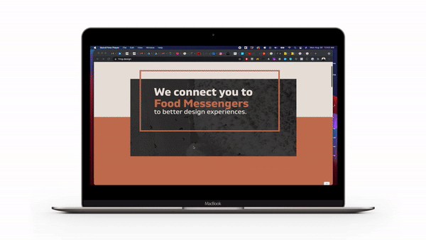
The core brand assets were used to build collateral including the website and social media assets. The website is a simple landing page to explain Who FRNG is and what they do. A lead generation form was added to the end and utilizes a category report as a piece of gated content to encourage conversion.
The result of this project provided the FRNG team the assets they needed to start marketing themselves and build a client base. As FRNG grows and expands I hope to help the team add case studies and blogs to the site as well as expanding their marketing initiative to include additional channels such as content marketing through youtube and developing a consistent email cadence.

Sample instagram carousel post

Sample instagram carousel post